
Fix three things first: your hero visuals and gallery sequence, your CTA and trust stack, and your page speed with real measurement behind it. Baymard's benchmark found 62% of ecommerce sites still run mediocre product page UX, and closing those gaps produced an average conversion lift of 35.26%. Everything below is the checklist and the sequence for doing it.
TL;DR:
- Improving hero images, gallery order, and page speed can significantly increase conversion rates, with speed fixes impacting both sales and revenue.
- Most product pages benefit from clear, visible options and images that follow a deliberate sequence, promoting trust and reducing abandonment.
- Optimizing mobile UX by exposing options, adding sticky CTAs, and ensuring button targets are thumb-friendly can drastically lower friction and abandonment.
- Incorporating authentic reviews, accurate stock counts, and targeted scarcity messaging builds trust and urgency without eroding credibility.
- Starting with high-impact, low-effort fixes and methodically testing results ensures scalable improvements, avoiding unnecessary redesigns or misguided efforts.
Table of Contents
- What Is the Fastest Path to Product Page Optimization?
- What Images Does a Product Page Actually Need?
- How Do You Write Product Copy That Ranks and Converts?
- Why Do Mobile Shoppers Abandon at the Selector Stage?
- What Makes a CTA and Trust Stack Actually Convert?
- How Many Reviews Does a Product Page Need to Build Trust?
- How Fast Should a Product Page Load?
- How Do You A/B Test a Product Page Without Fooling Yourself?
- Which Product Page Fix Should You Tackle First?
- Can You Personalize a Product Page Without Feeling Creepy?
- What's the Right Way to Cross-Sell on a Product Page?
- How Should Filters and Variant Selectors Actually Work?
- Does Showing Low Stock Actually Increase Sales?
- Skybound Scaling's Approach to Product Page Optimization
- Ready to Fix Your Product Pages? Here's the Next Step
- Primary Sources and Further Reading
- Sources
What Is the Fastest Path to Product Page Optimization?
Most teams treat product page optimization like a redesign project. It isn't. It's a punch list, and the punch list has an order.
Start with the items that touch the most traffic and require the least engineering time. Images and copy almost always deliver faster returns than a full rebuild, and Baymard's research backs that sequencing: fix the visible UX problems before you touch the backend architecture. Here's the checklist, ranked by typical effort against typical payoff.
- Hero image quality. Low effort, high impact. A sharp, well-lit primary photo shot on a clean background is the single highest-leverage image on the page.
- Gallery depth and order. Medium effort, high impact. Five to eight images beat three, and sequence matters more than most teams assume.
- CTA visibility. Low effort, high impact. If a shopper has to scroll to find "Add to Cart," you've already lost some of them.
- Trust stack placement. Low effort, medium to high impact. Shipping terms, return policy, and reviews belong near the price, not buried in a tab.
- Meta title and description. Low effort, medium impact. This is a 20 minute fix per SKU template, not per product.
- Page speed. Medium to high effort, high impact. Slow-loading hero images kill conversion before a shopper reads a word of copy.
- Structured data markup. Medium effort, medium impact. It won't move today's conversion rate, but it feeds the rich results that drive tomorrow's traffic.
Missing product information is one of the most common reasons carts get abandoned before checkout even starts, according to NN/g's ecommerce guidelines, which found that complete product information, visible options, and multiple images are non-negotiable, not optional polish.
Pick one KPI per fix so you know if it worked. Hero image and gallery changes should move add-to-cart rate. CTA and trust stack changes should move PDP conversion rate. Speed fixes should move both, plus revenue per visitor.
What Images Does a Product Page Actually Need?
Shoppers spend most of their time on your product page looking at pictures, not reading. NN/g's research puts image attention at roughly 65% of total time on page. That number alone should reorder your production priorities.
The winning sequence isn't random. It follows a narrative: hero lifestyle shot first, then detail angles, then a scale reference, then packaging, then user-generated content if you have it. Stores that follow this deliberate order tend to see stronger add-to-cart performance than stores that upload images in whatever order the photographer delivered them.
Here's the shot list that covers it:
- Hero lifestyle image. The product in context, showing what it does or how it's worn or used.
- Two to three detail angles. Close-ups on texture, stitching, hardware, whatever answers "what does the material actually feel like."
- One scale reference. A hand, a coin, a person, anything that kills the "is this bigger than I think?" hesitation.
- Packaging shot. Especially important for gifts and anything shipped in retail packaging.
- UGC or review photos. Real customer photos, even imperfect ones, build more trust than another studio shot.
Industry guidance settles on five to eight images per SKU as the sweet spot, enough to answer real questions without turning the gallery into a scroll marathon on mobile. Add video when the product has a mechanism, a fit issue, or an assembly step that a still photo can't explain. Save 360° spins for higher-priced items where the extra production cost is justified by ticket size.
On the technical side, serve images as WebP or AVIF, not legacy JPEG, and build a responsive srcset so mobile devices don't download a desktop-sized file. Lazy-load everything below the fold. Your hero image is almost always the Largest Contentful Paint element, so it should load first and load fast, not compete with a chat widget script for bandwidth.
Pro Tip: Shoot your scale reference and packaging photos in the same lighting setup as your hero shot. Mismatched lighting between gallery images is a small detail that reads as "cheap" to a shopper's eye, even when they can't articulate why.
How Do You Write Product Copy That Ranks and Converts?
Good product copy does two jobs at once: it convinces a human to buy and it tells a search engine what the page is about. Most teams optimize for one and forget the other.
Start with a headline and a one-line subtitle. The headline names the product plainly. The subtitle translates the single biggest benefit into plain language, not a spec. Below that, scannable bullets should convert features into outcomes: not "600 thread count," but "cool enough to sleep in through summer."
For the metadata that search engines read:
- Meta title formula: primary keyword, plus a modifier (size, material, use case), plus your brand name at the end.
- Meta description: one sentence stating what the product is, one stating who it's for or what problem it solves, kept under 155 characters.
- URL structure: short, lowercase, hyphenated, no parameter strings or internal SKU codes.
Structured data is where a lot of teams leave easy wins on the table. At minimum, mark up Product, Offer, AggregateRating, and BreadcrumbList schema. Done right, this is what pulls star ratings and price into your search snippet, which raises click-through before a shopper even lands on the page.
One more thing that quietly wrecks SEO: variant pages. If your red, blue, and green versions of the same shirt each live at separate URLs with near-identical copy, you're splitting review signals and diluting relevance across duplicate pages. Canonicalize variants to a single URL wherever your platform supports it, and use on-page selectors to switch between them instead of separate indexed pages.
Why Do Mobile Shoppers Abandon at the Selector Stage?
Mobile traffic dominates retail visits, and shopper conversion rates swing widely by device and market, which is exactly why device-level UX can't be an afterthought on a product page. If your size or color picker requires two taps to even see the options, you're adding friction at the exact moment intent is highest.
Here's how to remove it, in order of impact:
- Expose the options. Show size and color as visible buttons or swatches, never a hidden dropdown a shopper has to tap open first.
- Add a sticky mobile Add-to-Cart bar. Keep a compact product summary and the CTA pinned to the bottom of the screen as the shopper scrolls through images and copy.
- Size every tap target at least 48 pixels. Anything smaller and thumbs start missing, which shows up in your analytics as rage taps and abandoned sessions.
- Run an accessibility pass. ARIA labels on selectors, a logical focus order for keyboard and screen-reader navigation, and alt text that actually describes the image rather than repeating the file name.
That last point isn't a compliance checkbox. A shopper using a screen reader who can't tell which color swatch is selected simply leaves, and so does a shopper on an older phone whose browser can't parse a poorly labeled custom dropdown.
Pro Tip: Test your product page with your phone's screen reader turned on for five minutes. Most teams have never done this once, and it surfaces more friction than a full heatmap review.
What Makes a CTA and Trust Stack Actually Convert?
Your Add to Cart button needs to look like the most important object on the screen, not blend into the color palette of your brand. That means real contrast against the background, a minimum tap height around 48 pixels on mobile, and copy you're willing to test beyond the default. "Add to Cart" isn't sacred. "Get Yours" or a copy line that names the specific product sometimes outperforms it.
Directly below the price or beside the CTA, stack your trust signals in this order of priority:
- Shipping information. Cost and estimated delivery window, visible without a click.
- Return policy. One line, plainly stated, not buried in a footer link.
- Security or payment badges. Only if your checkout genuinely supports them.
- Live stock status. "In stock" or a specific low-count warning, never a vague spinner.
Conversion research summarized by ConversionStudio puts a well-placed sticky CTA at an 8 to 12% lift on its own, which is a meaningful number for something that takes an afternoon of engineering time to ship.
Scarcity and buy-now-pay-later messaging both work, but only when they're true. A "only 2 left" flag that resets every time the shopper refreshes the page erodes trust faster than it builds urgency. Use scarcity when your inventory data actually supports it, and place BNPL price anchoring ("or 4 payments of…") right under the price where it reframes the number without shouting.
How Many Reviews Does a Product Page Need to Build Trust?
Five reviews per SKU is the rough floor worth aiming for. Below that, a rating feels thin and shoppers discount it. Above it, the summary score starts carrying real weight in the buying decision.
Getting there requires more than a post-purchase email asking for stars. Incentivize photo and video reviews specifically, since ConversionStudio's synthesis puts the lift from review photos in the 20 to 30% range, a bigger jump than text reviews alone typically produce. Automate the request so it fires a set number of days after delivery, not after purchase, when the shopper has actually used the product.
Placement matters as much as volume:
- Summary score near the CTA, so the star rating is visible in the same glance as the buy button.
- Filterable review content, so a shopper who cares about fit can search "runs small" instead of scrolling forty reviews about color.
- A visible negative review or two, ideally with a brand response underneath it.
That last point runs against instinct, but a page with zero negative reviews reads as curated or fake. A negative review with a thoughtful reply shows the brand actually stands behind the product after the sale, which does more for trust than another five-star testimonial.
Pro Tip: Respond to negative reviews within 48 hours and reference something specific from the complaint. A generic "sorry for the inconvenience" reads as a template, and shoppers can tell.
How Fast Should a Product Page Load?
Target a Largest Contentful Paint under 2.5 seconds. That's the widely cited Core Web Vitals threshold, and on an image-heavy product page, LCP is almost always your hero image, which makes it the first thing to audit.
The fixes, in the order to tackle them:
- Compress and convert the hero image to AVIF or WebP and set it to load with priority, ahead of anything else on the page.
- Build a responsive
srcsetso a phone downloads a phone-sized file, not a 4,000 pixel wide desktop asset. - Lazy-load everything below the fold, including your review widget and recommendation carousel.
- Audit third-party scripts. Review platforms, chat widgets, and recommendation engines often load render-blocking JavaScript that has nothing to do with the product itself. Move what you can off the critical path or defer it until after the main content paints.
- Measure both field and lab data. Chrome UX Report gives you real-world numbers from actual visitors; a lab tool gives you a controlled diagnostic. Use both, because they answer different questions.
Small speed gains compound. Research cited by ConversionStudio associates improvements as small as one tenth of a second with conversion gains in the high single digits for some retail sites. That's not a rounding error. That's a page that was quietly losing sales before a shopper ever saw your CTA.
How Do You A/B Test a Product Page Without Fooling Yourself?
Pick one metric as your primary signal. For most PDPs, that's either add-to-cart rate or PDP conversion rate, depending on whether the change you're testing lives above or below the fold. Track revenue per visitor as a secondary check, since a change that raises conversion but drops average order value isn't the win it looks like on the surface.
Change one variable per test. If you swap the hero image and rewrite the headline in the same test, you'll never know which one moved the needle, and you'll end up making decisions off a result you can't actually explain.
Give every test real runway:
- Run for two full business weeks minimum, so you capture a full weekday and weekend cycle.
- Aim for at least 1,000 unique visitors per variant before you call a result, fewer and the noise will drown the signal.
- Watch guardrail metrics like average order value and return rate, not just your primary metric, so a "winning" variant doesn't quietly create a returns problem downstream.
- Use heatmaps and session replay before you test, not just after, to form a real hypothesis instead of guessing at what to change first.
Apple's own Product Page Optimization documentation for App Store listings is worth studying even if you're not shipping an app: it shows that a preview video sometimes converts worse than static screenshots, which is exactly the kind of counterintuitive result you only find by testing instead of assuming.
Pro Tip: Before you launch a test, write down your hypothesis and your kill criteria in one sentence. It stops teams from moving the goalposts halfway through when the early data looks discouraging.
Which Product Page Fix Should You Tackle First?
Score every candidate fix on three axes: effort, exposure (how much traffic touches this element), and impact (how much it's likely to move conversion). Multiply exposure by impact, then divide by effort, and rank the list.
A hero image replacement scores high on all three: low effort, every visitor sees it, and it's tied to the highest-attention element on the page. A full checkout redesign might score high on impact but so high on effort that it belongs in a later sprint, not the first one.
- Score every item on your checklist using effort, exposure, and impact on a simple 1 to 5 scale each.
- Rank by combined score and take the top three to five items as your first sprint.
- Split ownership. Hero images, gallery order, and copy usually sit with marketing or content teams. Sticky CTAs, structured data, and speed fixes usually need engineering.
- Set a KPI per item before you start, not after you ship.
| First sprint candidate | Owner | Primary KPI |
|---|---|---|
| Replace hero image and reorder gallery | Marketing / content | Add-to-cart rate |
| Add sticky mobile CTA bar | Engineering | PDP conversion rate |
| Rewrite benefit-led bullets | Marketing / content | Add-to-cart rate |
| Compress hero image, add srcset | Engineering | LCP / revenue per visitor |
Can You Personalize a Product Page Without Feeling Creepy?
Personalization on a product page works best when it's useful, not when it's a reminder that you're being tracked. The line between the two is thinner than most teams think.
Returning-visitor personalization is the easiest place to start. If a shopper viewed a specific size or color on their last visit, pre-select it on return rather than making them choose again. If they added an item to cart and left, surface that item quietly rather than resetting them to a blank page.
Behavioral personalization goes further: showing a different hero benefit line to a shopper who arrived from a price-comparison search versus one who arrived from a brand campaign. This requires clean data plumbing between your ad platforms and your site, which is exactly where a lot of teams stall out, not because the idea is wrong but because the integration work never gets prioritized.
Geographic and inventory-aware personalization is a quieter, less controversial win: showing accurate delivery estimates based on the shopper's location, or flagging when a size is nearly sold out specifically in their region. This feels helpful rather than invasive because it's answering a question the shopper already has, not inferring one they didn't ask.
Start small. A single dynamic element, like a pre-selected variant based on browsing history, tests cleanly and won't require rebuilding your entire personalization stack before you learn whether it's worth the investment.
What's the Right Way to Cross-Sell on a Product Page?
Cross-selling on a PDP works when it feels like a genuinely useful suggestion, not a quota the page is trying to hit. The placement and framing matter more than the algorithm behind it.
"Frequently bought together" modules work best directly below the main product images, framed as a bundle with a single combined price rather than three separate add-to-cart buttons competing for the same click. "Customers also viewed" belongs lower on the page, after the description and reviews, since it's a browsing prompt rather than a purchase nudge.
Upselling is a different move entirely: it's not about adding a second product, it's about nudging the shopper toward a better version of the one they're already looking at. A comparison strip showing "this model" against "the upgraded model" works well when the price difference is framed against a concrete benefit, not just a spec bump. "Add insulated lining for $12 more" converts better than a generic tier name like "Premium."
The mistake to avoid is stacking cross-sell modules high enough on the page that they compete with the primary product for attention. If a shopper hasn't decided to buy the main item yet, a bundle offer is noise. Keep the primary CTA and trust stack dominant, and let cross-sell content earn its place further down the scroll.
How Should Filters and Variant Selectors Actually Work?
Variant selection is where a lot of otherwise well-built product pages quietly lose shoppers. The failure mode is almost always the same: hiding options behind a dropdown that requires a tap to even see what's available.
Expose every meaningful option as a visible button, swatch, or thumbnail. Size, color, material, bundle size, whatever the axis is, a shopper should see the full set of choices in one glance without opening anything. Disable, rather than hide, out-of-stock variants, and mark them clearly so a shopper isn't confused about why a tap did nothing.
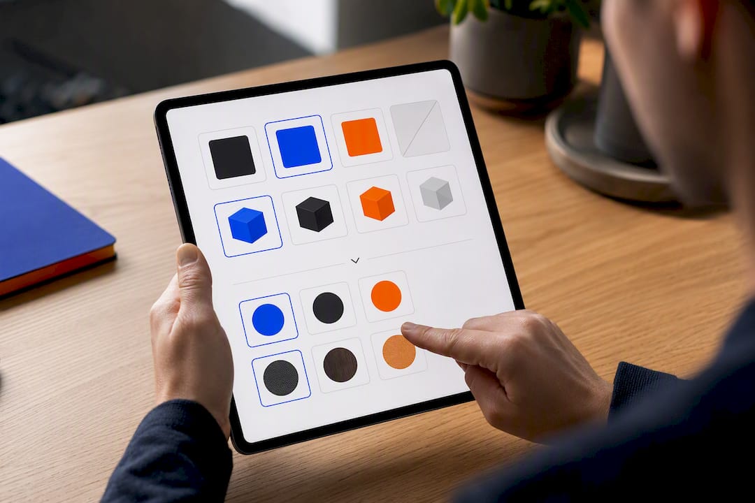
When a product has more than two or three variant dimensions, layer them: let the shopper pick color first, and update the size options dynamically based on what's actually in stock for that color. This prevents the frustrating dead end of selecting a size and color combination that doesn't exist.
For category and search pages that lead into your PDPs, filtering deserves the same visible-over-hidden principle. Faceted filters (price range, size, material, rating) should show live counts, so a shopper filtering to "under $50" and "size medium" can see immediately how many results remain rather than filtering into an empty page. That live feedback loop is a small technical lift with an outsized effect on whether a shopper keeps refining or gives up and leaves.
Does Showing Low Stock Actually Increase Sales?
Scarcity messaging works, but only when it's telling the truth. The moment a shopper catches a "hurry, only 2 left" banner that doesn't match reality, and refreshes to see it say the same thing an hour later, you've spent trust you don't get back easily.
Real-time inventory visibility does two jobs. It creates urgency when stock is genuinely low, and it prevents the far more damaging scenario of a shopper completing checkout only to get an out-of-stock cancellation email. Show exact counts once inventory drops below a meaningful threshold, roughly single digits, rather than showing a vague "limited stock" badge at every level of inventory.
Back-in-stock notifications matter just as much as scarcity messaging, and they're easier to get right. A simple "notify me" email capture on an out-of-stock variant does two things at once: it recovers a sale you'd otherwise lose entirely, and it builds a list of shoppers who've already told you exactly what they want.

Regional and warehouse-level stock accuracy is the detail that separates scarcity tactics that build trust from ones that erode it. If your inventory system can't distinguish between "sold out everywhere" and "sold out in the warehouse nearest this shopper," you're better off showing a general low-stock flag than risking a false scarcity claim that a savvy shopper catches and remembers.
Skybound Scaling's Approach to Product Page Optimization
Most of what separates a mediocre product page from a converting one isn't a mystery. It's a sequencing problem. Teams know the checklist; they don't know what to fix first, or they fix the wrong thing because it's the easiest ticket to close, not the highest-impact one.
The workflow that actually works starts with an audit, not a redesign. Score the page against the effort, exposure, and impact framework, pick the first sprint, and ship it in weeks, not quarters. Then test. Then scale what wins.
That's the same discipline behind how Skyboundscaling structures engagements across conversion rate optimization, image and creative production, technical performance work, and structured testing programs. A PDP sprint touches all four: better visuals need production support, a sticky CTA needs engineering time, and neither means anything without a measurement plan behind it to prove what actually moved.
Clients who've gone through this process consistently point to the same thing: it's not one big fix that changes the numbers. It's the accumulation of five or six small, correctly sequenced ones, tested in order rather than shipped all at once and argued about later.
— Ahmad
Ready to Fix Your Product Pages? Here's the Next Step
Building the hero shot, the sticky CTA, and the speed fix yourself is doable. Doing all three well, in the right order, while running clean A/B tests on top of it, is where most in-house teams run out of bandwidth. That's the gap a specialized scaling team exists to close: a team that handles the audit, the image production, the engineering, and the testing as one connected sprint instead of four separate to-do lists competing for the same week.

A typical engagement starts with a PDP audit scored against the same effort, exposure, and impact framework covered above, followed by a focused four to eight week sprint on the highest-priority fixes: conversion rate optimization, gallery and hero image production through web design, and the ecommerce-specific mobile and speed work that makes the rest of it actually load fast. No guaranteed metrics get promised upfront. The audit determines the plan, and the plan gets tested before it gets scaled.
If your product pages need this kind of structured push, start with a look at Skyboundscaling's full service lineup and request an audit to see where your first sprint should begin.
Primary Sources and Further Reading
The benchmarks and guidance behind this checklist come from three sources worth bookmarking directly:
- Product Page UX Best Practices 2026 – Baymard Institute: the UX benchmark behind the 62% mediocre-UX finding and the 35.26% average conversion improvement figure.
- UX Guidelines for Ecommerce Product Pages - NN/g: the research behind image-attention share and the must-have product information rules.
- Product Page Optimization - App Store - Apple Developer: Apple's own documentation on live creative A/B testing, directly relevant for app developers running product page tests on their store listings.
Sources
- Product Page UX Best Practices 2026 – Baymard Institute
- UX Guidelines for Ecommerce Product Pages - NN/g
- Product Page Optimization - App Store - Apple Developer